Skai–Imaginary innovative product

back to works
Skai Design Guidelines Page #1: Page #1 Of Design Guidelines
Published on Tags: branding, case study, identity design, product design, tech product

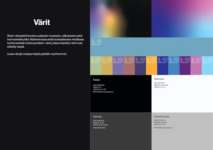
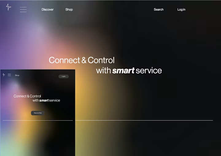
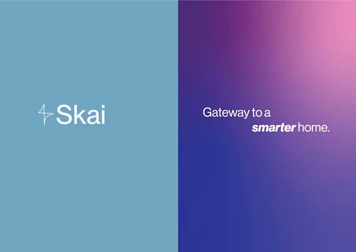
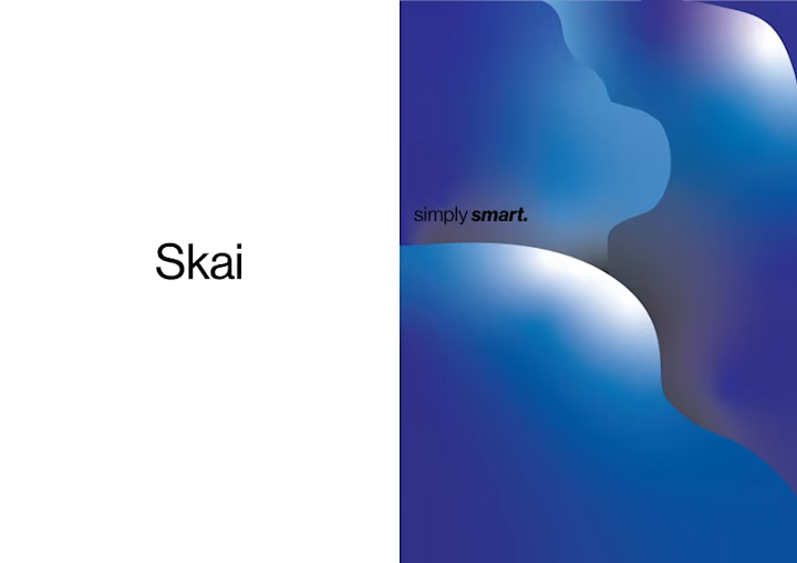
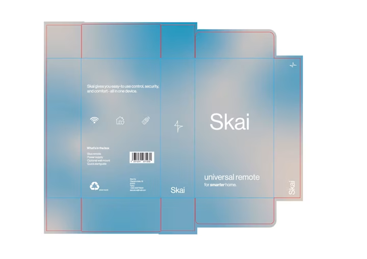
I invented a product for this exercise: Skai, a universal remote. The constraint was making tech feel approachable rather than cold.

The identity uses clean lines and a limited palette—design language borrowed from consumer electronics brands like Teenage Engineering. Packaging and UI mockups share the same visual system: bold type, restrained color, generous white space.

The images below show Skai's design guidelines.

Skai Brand Color PaletteHomepage / Landing Page For Skai BrandAdvertisements For Skai. Two Panels With Different Styles Of Marketing Ads. The First Ad Has Simple Design With The Brand Name And Logo And The Second Uses Mesh Gradient To Create Modern Look. A Gradient Is A Gradual Transition From One Color To Another.Advertisements For Skai. Two Panels With Different Styles Of Marketing Ads. The First Ad Has Simple Design With The Brand Name And Logo And The Second Uses Gradient Blobs To Create Modern Look.Skai Product Packaging Box Dieline, Die Cut And Cut Lines TemplateImage Of An Actual Product Packaging I Printed Out Of Cardboard, Folded Into Shape By Following My Dielines. I Create The Product Photo With A Mirror Where I Placed The Product Box On Top. The Backdrop Of The Image Is A Cloudy Skyline, That Plays On Words With The Product Name "Skai".