
The client asked for two directions—one calm, one bold—to see which matched their personality.
New logo(s)
Modern logos live on phone screens, so I kept details minimal. I created two versions: a mark and a wordmark, usable together or separately.
Concepts
Two concepts, same logo, different palettes.
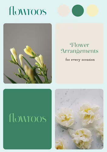
Green direction
I pulled greens, beige, and soft yellow from photos of the client's actual arrangements—stems, leaves, wrapping paper they already used. This direction suits wedding and corporate clients where restraint reads as quality.
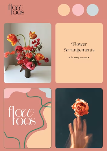
Red direction
Same logo, opposite energy—reds, oranges, peach. This version targets a younger audience: birthday parties, celebrations, arrangements that photograph well for social.
The client went with green. The red felt like a different business.